Mini heuristic analysis I UX case study
IRCTC redesign
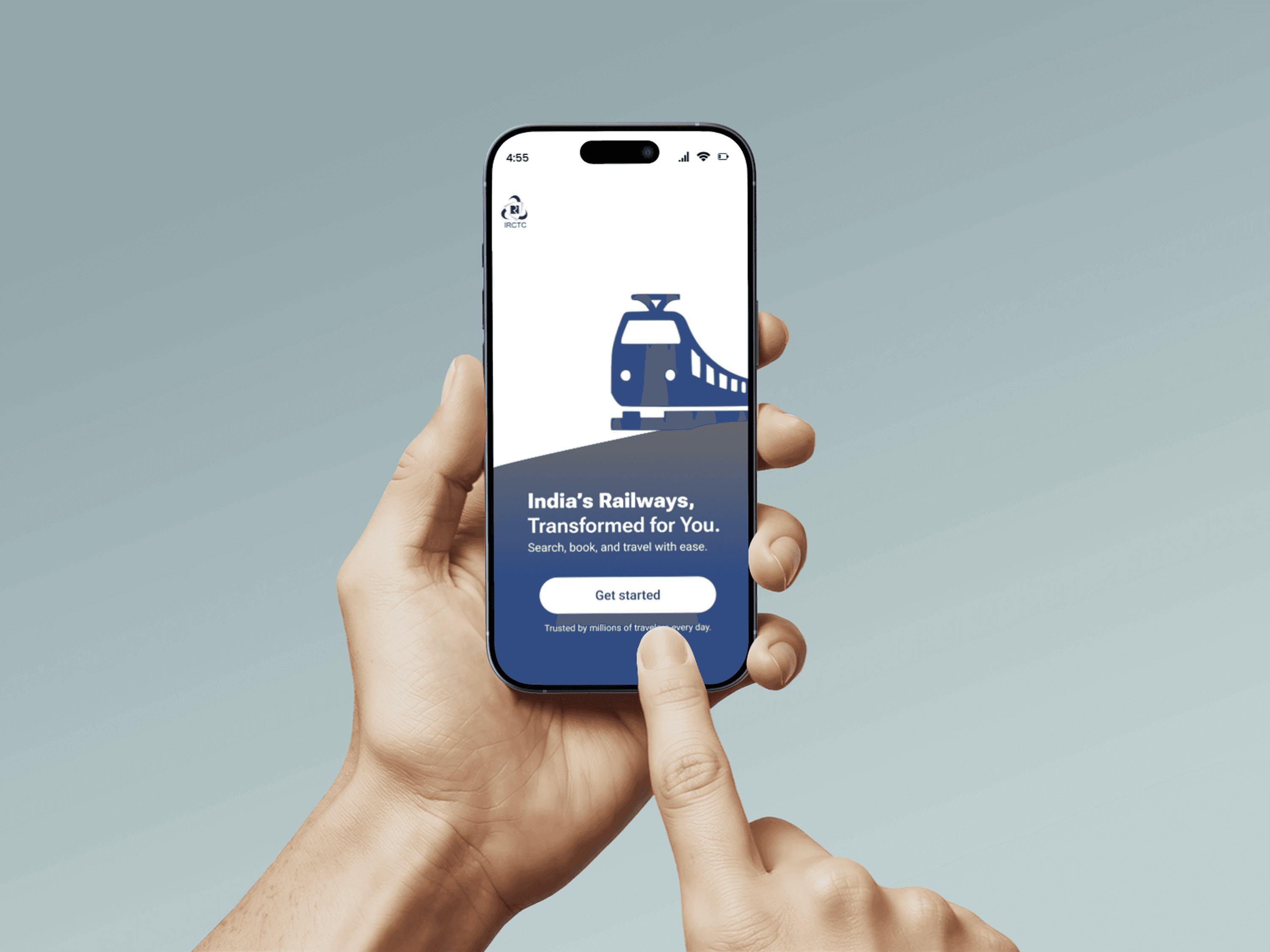
IRCTC, India's official railway booking platform, is widely used but often criticized for its complex user interface and confusing user flow. This mini case study focuses on conducting a heuristic evaluation to identify key usability issues and proposes a redesigned experience that is cleaner, more intuitive, and user-friendly. The goal was to streamline the booking process, reduce cognitive load, and enhance overall accessibility for a smoother user journey.
Overview
To improve IRCTC’s first-touch experience by redesigning the login and signup flow using Jakob Nielsen’s 10 usability heuristics.
To address the usability issues found in the IRCTC website, the redesign simplifies the user interface by streamlining the booking flow, reducing visual clutter, and enhancing the information hierarchy. Key actions like train search and ticket booking were made more intuitive with clearer CTAs and better grouping of related options. The design also improves accessibility and responsiveness across devices, aiming to provide users with a faster, more seamless experience.
Research
I started with a heuristic evaluation to identify usability issues in the IRCTC platform. I focused on simplifying navigation, improving visual hierarchy, and reducing cognitive load. Through wireframes and iterations, I introduced a cleaner layout, intuitive CTAs, and a consistent design to enhance usability and accessibility across devices.
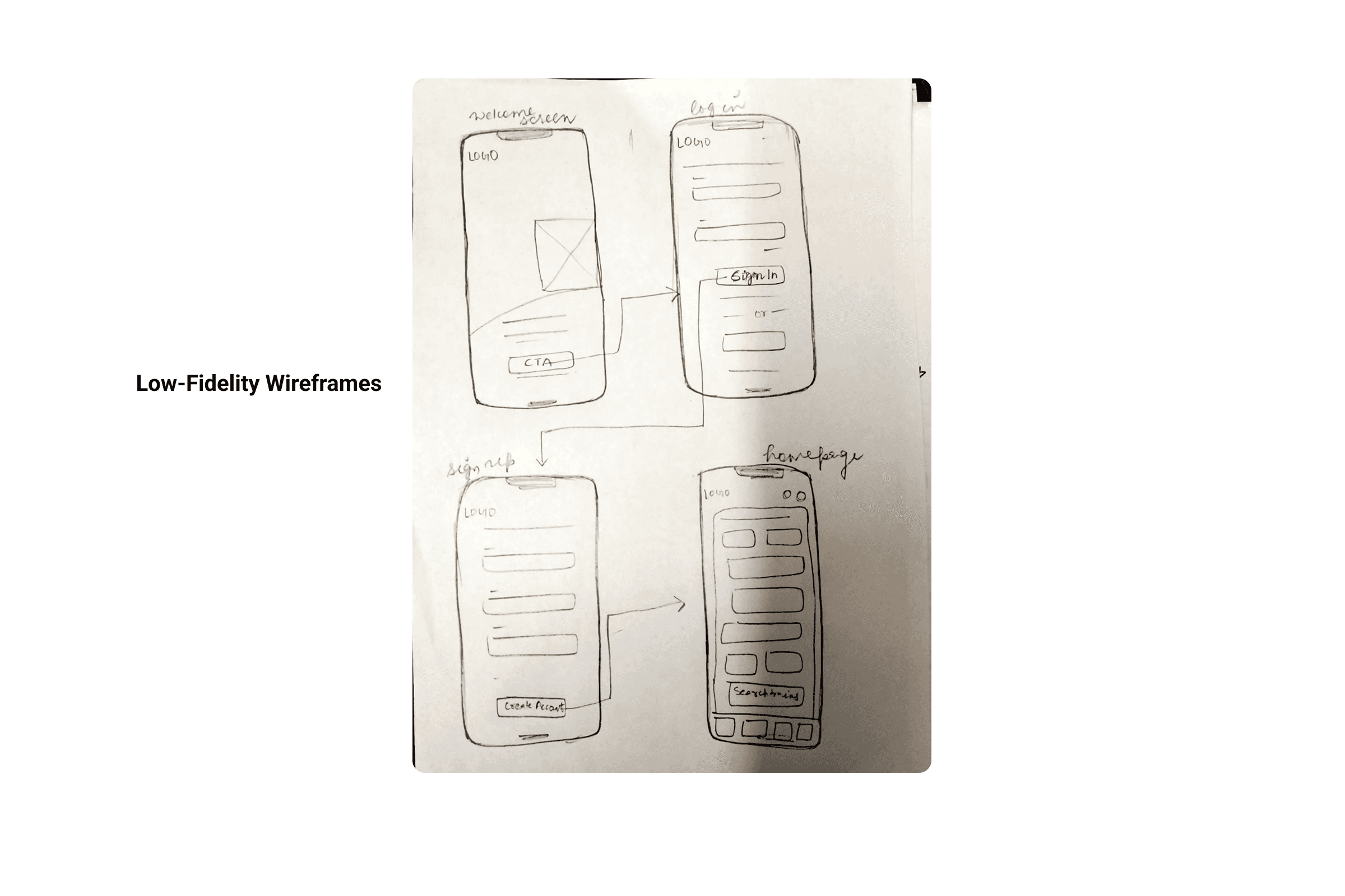
Design
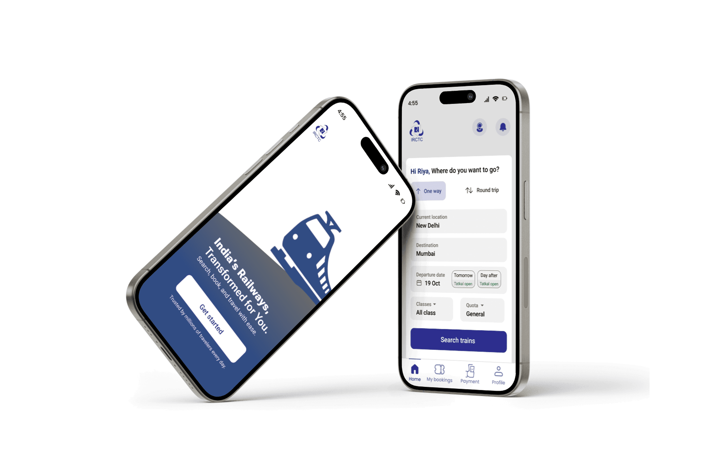
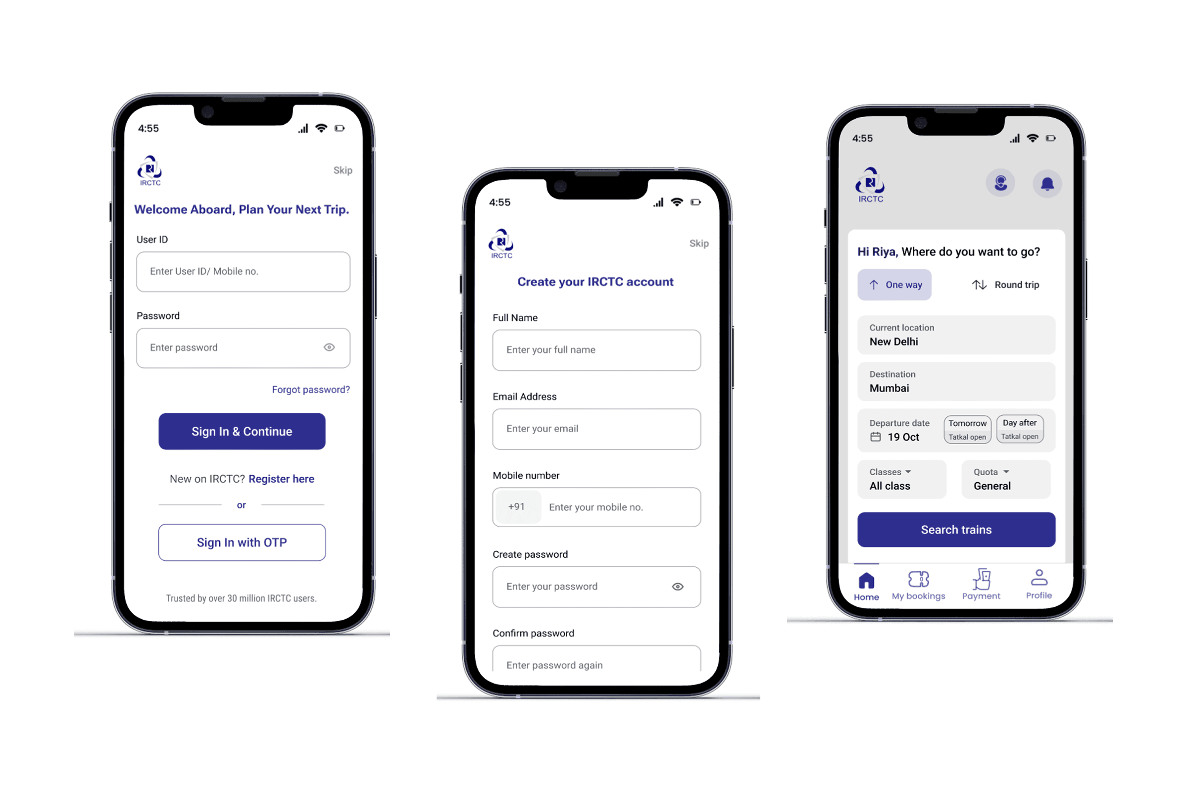
The design concept focused on creating a clean, clutter-free login experience that reduces user confusion. I prioritized clarity, accessibility, and efficiency—making sure users can log in quickly with fewer distractions. Emphasis was placed on visual hierarchy, intuitive input fields, and helpful feedback to enhance overall usability.

Results
Reduced user confusion by streamlining the login process and improving form clarity.
Increased task completion rate by simplifying the flow and enhancing button visibility.
Received positive feedback on the cleaner interface, better alignment, and ease of use during usability testing.